Farm to Table Pittsburgh educates individuals, school teachers, students and employer groups about the benefits of eating local food. They have an annual conference every spring and in 2013 created a Fall Harvest Tasting. They wanted consumers to get a real taste of what the Western Pennsylvania region has to offer during a growing season.
Highlights
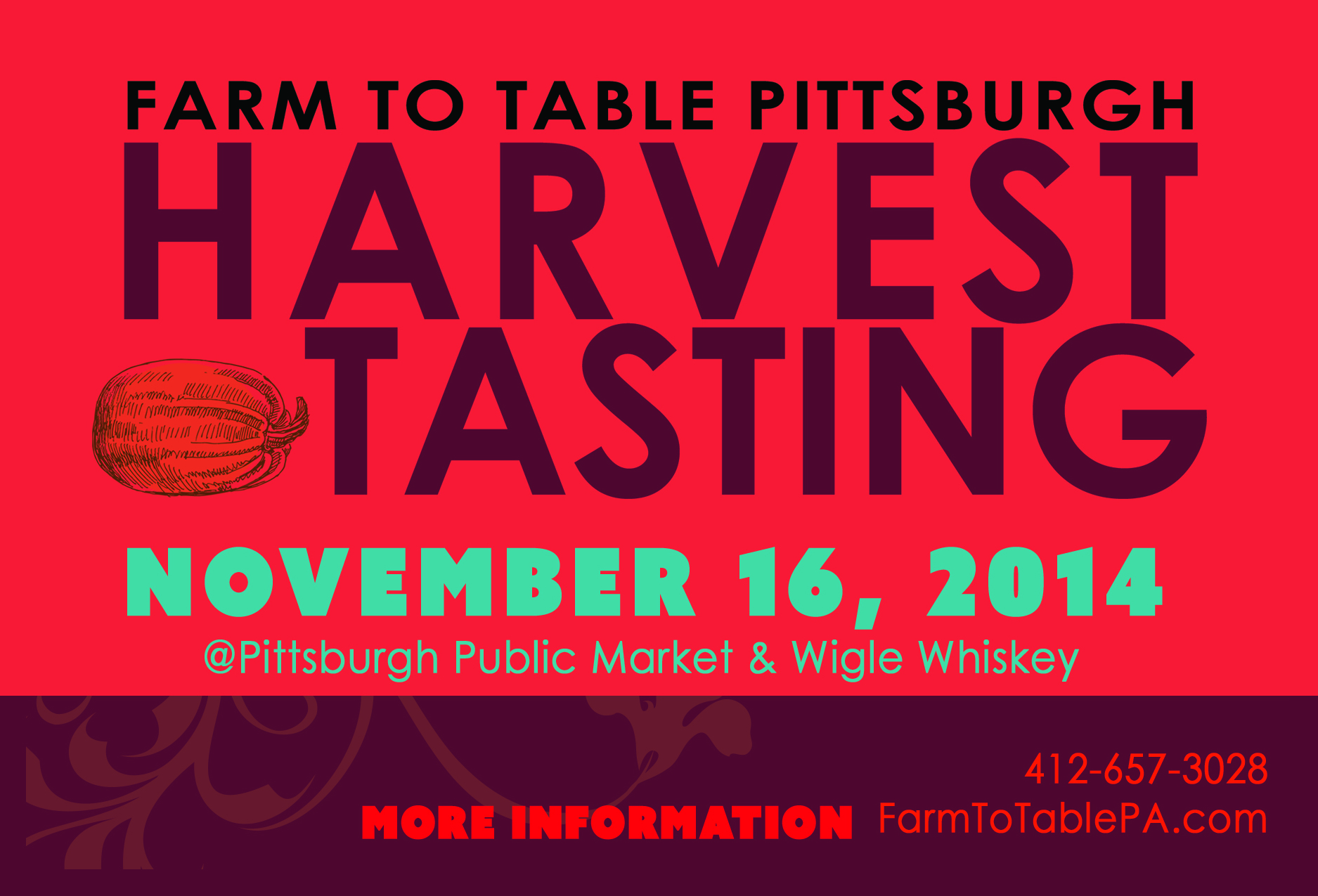
Erin Hart, of Farm to Table Pittsburgh, asked me to design something that was eye catching, but evoked the colors of an autumn palette. Event collateral is tough! You need to fit a lot of information on one piece or have a great call to action for the user to take more steps to get more information, like visit a website.
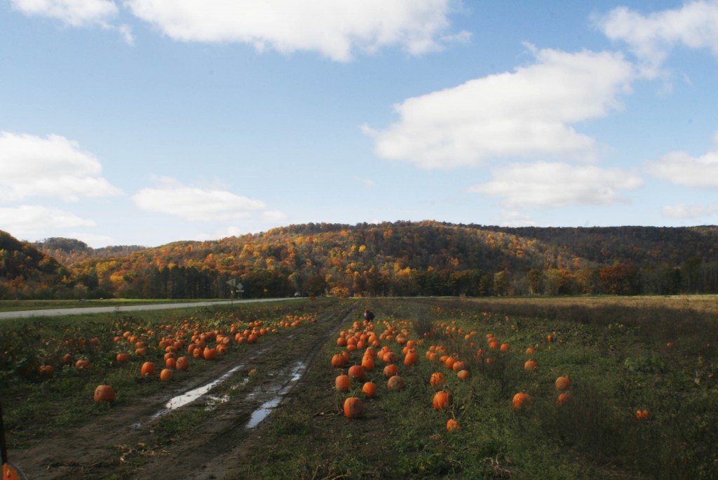
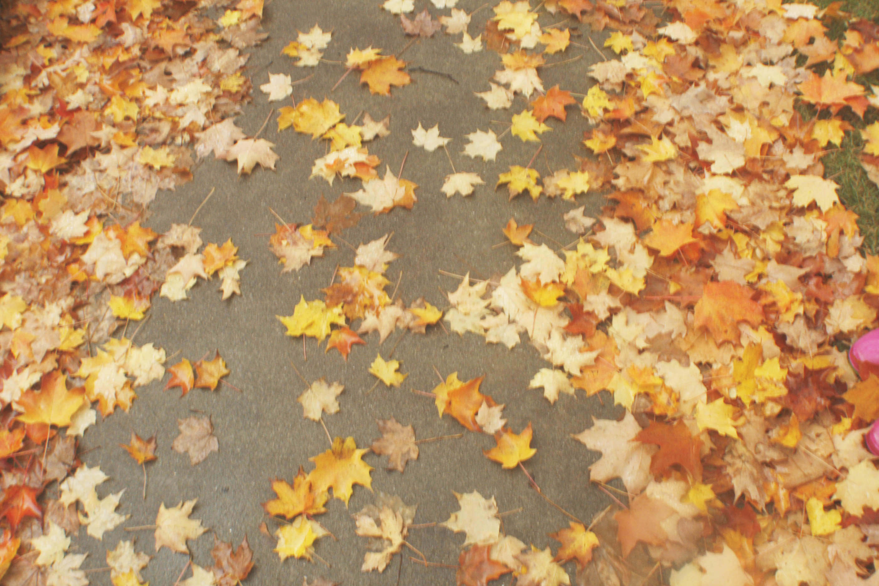
I took this picture while picking out pumpkins with my kids in the fall. What looks like a turkey in the middle is actually my daughter 🙂 The blues, greens, yellows, oranges and reds were all pulled from this image to use to make these postcards:
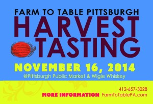
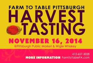
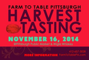
Each postcard has the same content but mixes up the color backgrounds. The colors are eye catching from across a room or on crowded internet pages. They are fun to look at!
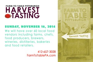
Here’s more inspiration: