Networking for Supportive Services Professionals
American HealthCare Group is a company that provides Supportive Services for affordable housing developments. They put Care Advocates on location at affordable housing units to help the residents find the right type of health care, preventive wellness services, and community resources that are available to them.
The Where to Turn Resource Fair
With their experience in the Supportive Services industry, American HealthCare Group realized there is a large network of non-profits and businesses that provide services that aren’t reaching the advocates. Thus, the Where to Turn Resource Fair was created as a free event for social service professionals, teachers and caregivers to come and learn about what was available to them to help better the lives of the people they serve.
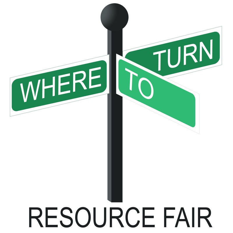
The Logo Concept
The concept speaks directly to the daily decisions that caregivers have to make that will affect the long-term outcome of someone else’s wellbeing. The crossroads icon shows empathy and it includes the message that they’ve reached the right the place.
The Logo in Use
The logo is used on the American HealthCare Group website, on the bi-annual event programs and advertisements. It works as a square icon and uses a white block background. It is a four-color logo – but can easily be stripped down to 3, 2, or 1 color depending on the printer capacity that is being requested.
